GEO381/550 Lecture note of
November 2nd 2004 Proportional Symbol Map
Proportional symbol maps
Shows
relative magnitudes of phenomena at specific locations

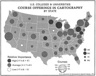
Symbol
varies its size in proportion to the quantities
it represents
Two
kinds of proportional symbol maps:
(1)
data occur at points (2) data are aggregated at points within areas (Figure
9.2)
Demo
in ArcView:
(1)
data occur at points: Number of hospital beds
a. choose a graduated symbol map
(2)
data aggregated at points within areas: Total population by county
a. use chart map – properties
button - set size field to the field to be mapped
b. extract centroid, and then make
a graduated symbol map from the centroi
When to use proportional
symbol maps?
I.
Phenomenon
Represents
the discrete phenomenon with abrupt variation

II.
What kinds of data
Practically
any kind of magnitude data can be used:
Examples:
(1) tonnage shipped at ports
(2) retail sales
(3) total population enumerated
by county
(4) employment enumerated by
metropolitan areas
(5) newspaper circulation
enumerated by service areas
(6) number of workers in
asbestos factory
(7) number of deaths per
100,000 caused by breast cancer
III.
Variation of data
Should
be large so that maps can reveal non-monotonous spatial pattern even though it
may be technically accurate (The map should be intuitively appealing)
Figure
9.13: Monotonous pattern is not good
Figure
9.8 Clustered pattern is good
Symbol form
2-Dimensional
Compare
two maps: circle versus square symbol

Circle:
compact, visually stable, easy symbol scaling, non-linear perceptual scaling
Square:
less compact, less visually stable, linear perceptual scaling
3-Dimensional

Visually
attractive, space-saving scaling, difficulty of measuring dimension correctly
Table
9.1 Differences in mapped areas of circles and spheres
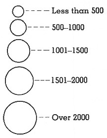
Proportional symbol
scaling
How
to scale symbol size in proportion to the value to be mapped
Have
two kinds: (1) unclassed (2) classed
- Unclassed
- Absolute scaling
- Perceptual scaling
(apparent-magnitude scaling)
- Classed
- Range grading
Absolute scaling versus
Perceptual scaling
When
humans read symbol, length is estimated correctly, but area and volume are
underestimated according to psychophysical investigations.

Figure
9.5 Apparent-magnitude curves for length, area, and volume

Figure
9.6 Absolute and apparent scaling of proportional circles
Absolute
scaling: area of symbol is directly proportional to the magnitude mapped
Perceptual
scaling (apparent-magnitude scaling): area of symbol gets enlarged to
compensate for underestimation
Example:
suppose we have two values, 6400 and 1600, that are to be symbolized and scaled
by proportional circles
Absolute
scaling will yield 2:1 in terms of radius
Perceptual
scaling will yield x:1 in terms of radius where x is bigger than 2 which
incorporate correction factor to compensate for the underestimation
In
ArcView
Set
the number of values to the number of classes in proportional symbol map of
point layer (Default option for ArcView graduated symbol map is absolute
scaling)
Perceptual
scaling in ArcGIS: proportional symbols appearance compensation
Range grading
Data
array is divided into groups
Each
circle is easily differentiated from its neighbor (Figure 9.11)
No
more than five classes are advisable for this form of scaling
Graphic design issues
- Avoid symbol overload
- Masks other symbols
- Using more than two
variables are not desirable: confuses map readers
- Choose symbol form
and scaling methods appropriate to perceptual principles
- Circle versus square
or 2D versus 3D
- Absolute versus
apparent scaling methods
- Unclassed versus
classed scaling methods
- When range-graded,
the size of symbols should be distinguishable from neighboring symbols
- Remember that the
purpose of this map is to show the relative
magnitude of variables
- Data variation should
be large to show discriminating patterns
- Opaque or transparent
symbol? (Figure 9.15)
Demo: pros and cons of each
- Map symbols should
have contrast to their surroundings
- Use dark shade
rather than light shade for filling the symboL
The
above-mentioned guidelines embody the following principles:
- Symbols should be
made to appear as strong figures in perception
- Symbols should be
made to stand out from its surroundings
- Symbols should be
clear and unambiguous in meaning
Next
time: dot density map (READ CHAPTER 8)