Geog 258: Maps and GIS
February 13, 2006 (Fri)
Quantitative thematic maps
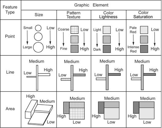
Map symbolizations for quantitative thematic maps
Some map symbols have
connotation of varying magnitude in value
Use them for representing the
attribute measured in an ordinal, interval and ratio level
Measurement and count
How quantitative information
is measured
Direct measurement from a
zero-dimensional geographic feature (e.g. height of tree)
Use of data collection area: how
many within the unit (e.g. census count)
Interpolation: inferred values
from sample points (e.g. temperature)
Three spatial sampling methods
Measuring values at all
locations are often infeasible
Appropriate sampling scheme
needs to be employed
Random: arbitrarily sampled
points
Systematic: gridded points
Stratified: make sure that
certain characteristics of the population are adequately sampled
What is desirable sampling
scheme?
As dense as possible in terms
of random or systematic sampling
Be stratified in an
appropriate (given applications) manner
Commonly used quantitative thematic maps
Proportional symbol map
varies map symbols in proportion to the magnitude
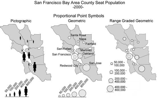
Map A Map B Map C
Difference
between A and {B, C}?
Difference
between B and C?
Proportional symbol map can
use either pictographic or geometric element
Value can be measured either in
continuous scale or be range-graded
Range-grading often adopts
perceptual scaling to adjust for human eye’s underestimation of symbol size (in
other words, the size of symbol is not exactly in proportion to magnitude in
values of geographic features, but rather is slightly larger than their
proportional values)
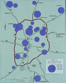
Proportional symbol map can
be used for portraying point-like or line-like features; for example, line
thickness or width is used to represent varying road class (which is ordered;
see Figure 7.5)
Size of Shopping Mall
The location of symbol can be
either at the actual location or in the representative location
Dot map
This time, does not use size,
use the number of dots to represent varying magnitude
How it is made?
Let’s say there are 10,000 people
n in
You decide unit value for
each dot, let’s say 1000
The number of dots = total number
of counts / unit value = 10,000 / 1000 = 10
As a result, 10 dots will be
placed in
How it works? I mean how
people read/interpret this kind of map?
People usually do not count
the number of dots, but rather attempt to gain a general impression of spatial
distribution (how dense and how sparse)
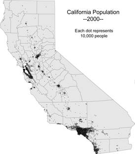
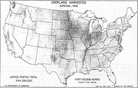
Also the location of dots
cannot be considered exact. Most of the time, it is randomly distributed within
the observation unit (especially computer mapping). So what if the data is
complied in the level of State? It is possible that many dots can be
distributed in desert area, which does not provide fair representation of
population distribution. Sometimes it is useful to adjust the distribution of
dots to true variations given by related variables (e.g. land use).
Choropleth map
One of the most widely used
thematic map
Due to prevalence of census
data
Choro + pleth = area + value
Value applied to area
Values in area are shaded in
varying tones of color (color hue or saturation)
As the value is measured in a
ratio scale, a range of possible values are large.
It is common to group values
into the limited number of class (classification)
The number
of classes and classification methods have tremendous impact on appearance
Such decisions should be
justified whenever appropriate (refer back to cartographic abstraction)
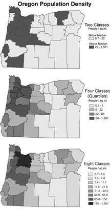
Can population density (normalized
value) be seen as continuous phenomenon or discrete phenomenon? The value
reported within the areal unit is presumed to be
uniform. Tax rate per county? Representative value (e.g. median income, median
age per census tract) is also seen as continuous statistical surface. If such
values can be measured at all locations, it is considered continuous.
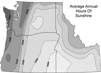
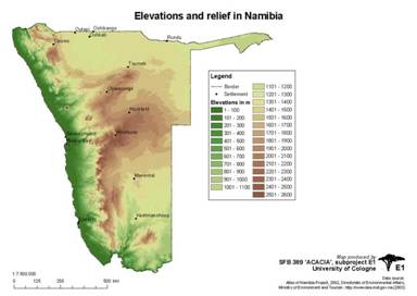
Isoline map
Shows continuous surface
Changes are gradual rather
than abrupt
Usually made from
interpolation of values at sampled points
Phenomenon space
Map types can be placed into
two-dimensional matrix.
(1) Row: Discrete or
continuous
Can values be measured at all
locations?
(2) Column: Abrupt or smooth
Do values change abruptly or
smoothly?
|
|
Abrupt |
Smooth |
|
Discrete |
Proportional symbol map* |
Dot map |
|
Continuous |
Choropleth map |
Isoline map |
*when feature is at actual
location
Other maps
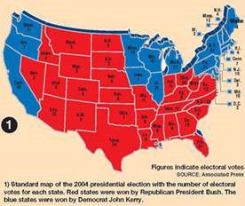
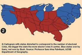
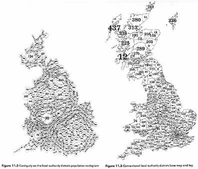
Cartogram
Varies areal
size in proportional to magnitude of values
It distorts geometry of real
geographic features (e.g. political boundary), but sometime it can provide a
fair portrayal of geographic phenomenon that you’re interested in because land
size often overshadow our fair perception. Are you interested in candidate vote
or land size?
Population
map of the
Dasymetric maps
Shows variation within areas
of inherent homogeneity
Small variation within area
and large variation between areas
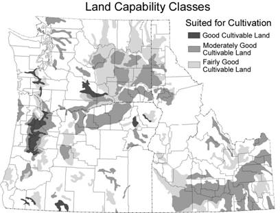
Compare cartogram/dasymetric maps to choropleth map
Cartogram vs. choropleth map: whether area size varies
Dasymetric vs. choropleth map: the nature of boundary
Multivariate maps
Multiple variables can be
mapped; good for showing related info (e.g. ethnic composition)
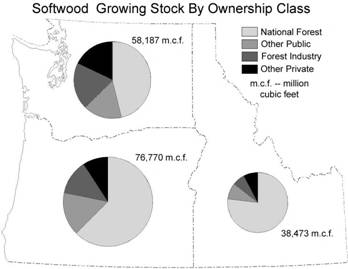
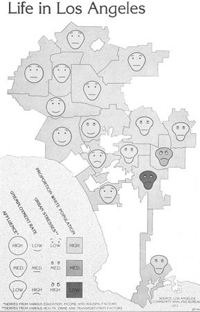 use Chernoff’s method
Review questions
What type of map is this? {proportional symbol, dot, choropleth,
isoline, cartogram, dasymetric}
What type of maps are these?
{proportional symbol, dot, choropleth,
isoline, cartogram, dasymetric}
What type of maps is this? {proportional symbol, dot, choropleth,
isoline, cartogram, dasymetric}