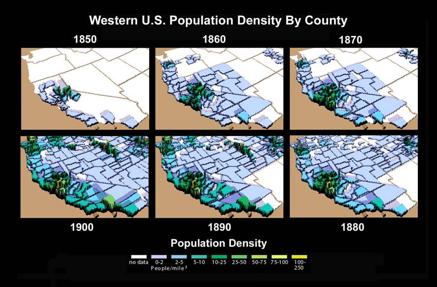
Geog 258: Maps and GIS
January 11 (Wed)
Cartographic abstraction
What is cartographic
abstraction?
The process of transforming
reality to a map
This process involves far
more than simple reduction
Maps are like caricatures in that
they emphasize certain features and de-emphasize others. Similarly, a map maker
attempts to portray the essence of a situation, as defined by the map’s purpose
Cartographic abstraction
process is made up of
1. Selection
2. Simplification
3. Classification
4. Symbolization
We will focus on
classification and symbolization
Selection
Map makers decide where
(regions), when (time frame), and what (variables to be mapped) guided by
purposes
Which variables should be
included?
Q. Maps for canoeist
Q. Hiking map
Insets can be used if maps in
different scales are needed
Simplification
Determine important
characteristics of feature attributes and eliminate unwanted detail
What to keep and what to
eliminate?
1) Relative importance of
feature/attribute
2) Relation of that class
of feature to the map’s purpose
3) Graphic consequences of
retaining the feature
Classification
Needs for data
classification
- For better recognition of meaningful and
revealing pattern
- For better management of symbol selection
- For map readability
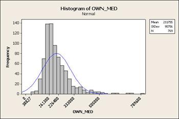
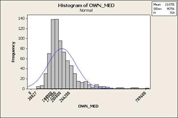
You may think data
classification simply results in a loss of detail, but data classification
offers more through an enhanced interpretive power. It’s a kind of data
preprocessing.
Consequences of different
classification methods
Different classification
scheme leads to different conclusion.
Therefore, it is important
to consider which method is appropriate to different data sets. Understanding
the distribution of data sets as well as underlying phenomenon is a must to be
a wise map author.
What does data
classification do?
- Summarizes data before being portrayed in
graphic form,
- Reduces data into forms more suitable for
straightforward communication
- Promotes clarity of purpose or meaning by filtering
out details irrelevant to the map’s function or theme
Methods of data
classification
In particular, grouping
numerical values into class: there are no absolute rules for qualitative
classification, thus we only discuss quantitative classification
Determining class intervals
and class boundaries affects map interpretation
Number of classes: usually
4 to 6 classes due to the limitation of human perception
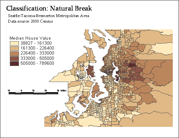
Classification schemes can
be grouped into four types:
1.
Not related to the distribution
a) Exogenous: use values not
related to the way the data are arrayed (e.g. disease-incidence rate)
b) Arbitrary: use rounded
numbers having no particular relevance to the distribution (e.g. equal step)
2.
Relevant to the distribution
c) Idiographic: determined by
particular events (e.g. natural breaks)
d) Serial: use descriptive
statistics (e.g. quartiles, standard deviation, equal interval)
---------------------------------------------------------------------------------
1. Exogenous schemes
Class boundaries defined by
criteria external to distribution of data
e.g. income data classified
into tax brackets
Useful when map should be
matched to external criteria
---------------------------------------------------------------------------------
2. Arbitrary schemes
Class boundaries are set by
arbitrary criteria
e.g. 0-20, 20-40, 40-60, 60-80,
80-100
Useful when a series of
maps need to be compared
Works best with data that
has a rectangular distribution
Equal Intervals
The whole range of value is divided by the number of
class to return class interval. Each class has the equal intervals
---------------------------------------------------------------------------------
3. Idiographic schemes
Class boundaries defined by
the shape of the data distribution
Natural Breaks
Form groups that are
inherently homogeneous while assuring heterogeneity among classes
Quantiles
Put an equal number of
values in each class; can show flattened pattern of skewed data sets
--------------------------------------------------------------------------------
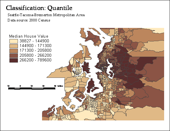
4. Serial schemes
Class boundaries are
defined by statistical or mathematical functions
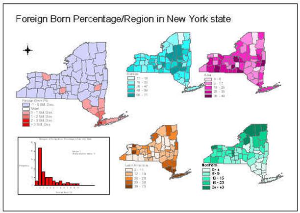
Standard deviations
Obtain mean and standard
deviation, and then determine class boundaries by adding or subtracting the
deviation from the mean
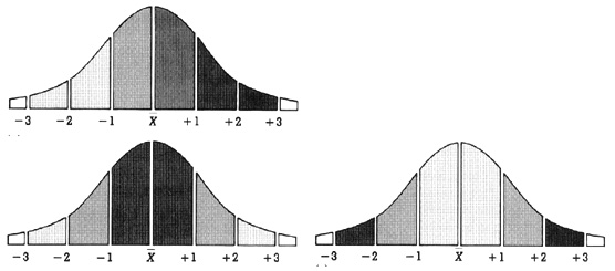
Useful when you are
interested in areas that deviate the most or least from average
--------------------------------------------------------------------------------
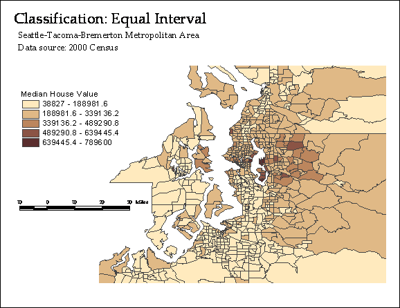
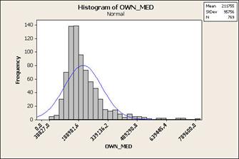
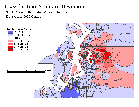
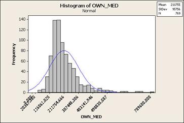
Illustration: let’s map
median home value by census tract in
Symbolization
Map uses symbols. Maps use
different kinds of symbols as follows:
Kinds of symbol (or visual
variables)
• Shape 
•
Size 
•
Color
–
–
Value (brightness) 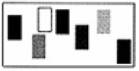
–
Saturation (purity) 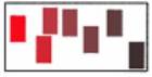
•
Pattern
–
Arrangement 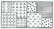
–
Orientation 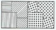
–
Texture 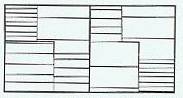
These symbols have inherent logics; they are either
distinguishing or ordering.
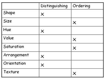
Logics behind symbols should be matched to the
measurement scale of data mapped.
Appropriate choice of symbols by dimensionality of
features
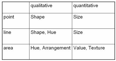
Q. What kinds of symbols are used in the following
maps, and how do they match the level of measurement of data mapped?
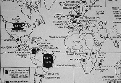
Shape is used to distinguish between coffee production
and consumption
Size is used to indicate magnitude of coffee
production and consumption
Within each map, value is used to indicate graded percentage
In the lab next week, you
will be asked about
·
Level of
measurement {Nominal, Ordinal,
Interval, Ratio}
·
Kinds of
symbols {Shape, Size, Color Hue,
Color Value, Color Saturation, Pattern, Pattern Arrangement, Pattern
Orientation, Pattern Texture}